IMS One App
UX design of IMS flagship app “One App”
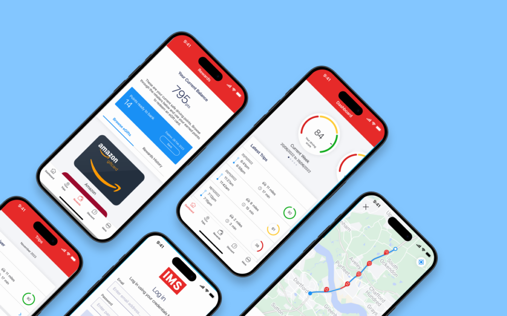
One App is a newly launched, configurable, white labelled telematics app, used by a number of top insurers worldwide and designed to change driving behaviour, reduce road risk and deliver better outcomes for young drivers.
20% Off On Tank Tops
Lorem ipsum dolor sit amet, consectetur adipiscing elit. Proin ac dictum.
Latest Eyewear For You
Lorem ipsum dolor sit amet, consectetur adipiscing elit. Proin ac dictum.
Let's Lorem Suit Up!
Lorem ipsum dolor sit amet, consectetur adipiscing elit. Proin ac dictum.
Home / IMS One App
Product Goals
The goals for delivery of One App were to produce:
- An application that is well designed, easy to use and provides an enjoyable end user experience that is built around it’s core functionality.
- An application that is configurable and customisable to meet the individual needs of the customer and the end user.
- An application that is measurable and enables feature experimentation so that new functionality can be built and tested to ensure goals are being met.
UX Design Process
As IMS did not have a UX resource prior to my employment, a large part of this project involved putting processes in place in order to bridge the gap between requirements and product build.
As part of this process I implemented the below UX design process flow, in order to facilitate the product development cycle.

Personas
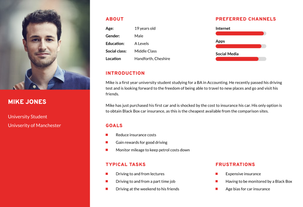
Based on the interviews and analysis of customer data I created a series of Personas, in order to help understand the needs, behaviours and attitudes of our end users. This formed the backbone of the entire product development process. The key end user personas identified as:
- Male and female drivers
- Between the ages of 18 and 21 years old
- In either further education or new employment
- Low mileage per annum
- Living at home or at university
- Zero to one years no claims bonus
User Journey
With this being a feature rich and complex app, information architecture was key. Therefore, I mapped out user flows for every feature and then determined how these would interact with each other. This provided a clear understanding of the full user journey and how this could be optimised for end users, prior to designing the interface.

Competitor Analysis
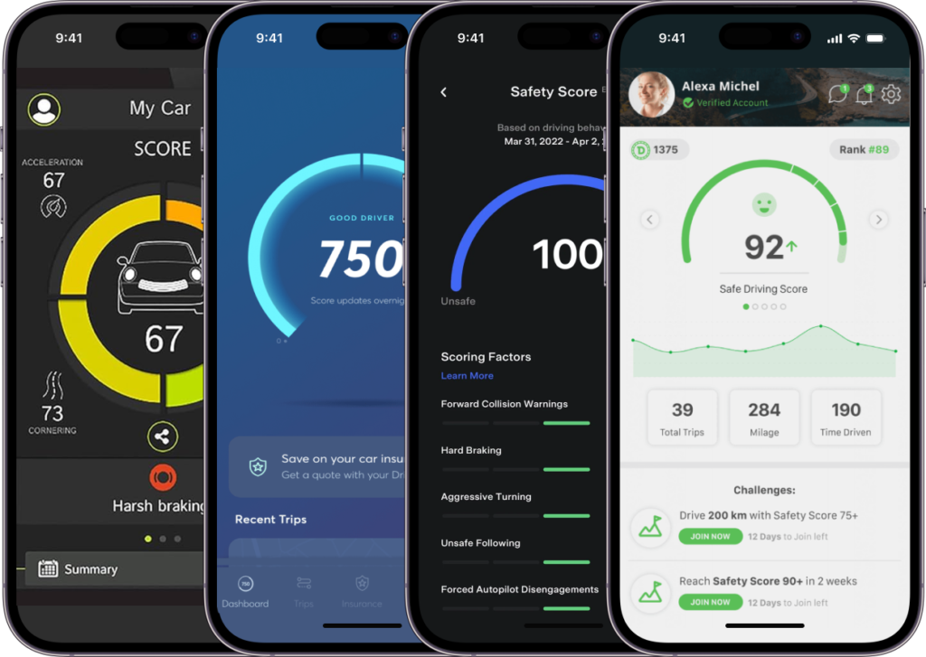
With IMS One App being a completely new product to market, I performed competitor analysis, in order to identify potential usability solutions, focus efforts on the target market and inform design decisions.
Wireframes & low fidelity prototypes
Following sign-off of the user flows and drawing inspiration from the analysis of our market competitors, I ran an additional series of workshops to wireframe out (using Adobe XD) and collect feedback on potential layout solutions for the product feature set. After a number of iterations wireframe prototypes were created in order to provide a realistic view of the end app product functionality and flow. The final prototype can be viewed here.
UI design
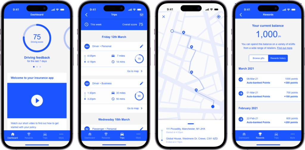
I then worked with the UI team to produce the final One App designs using Figma, which included the following:
- Creation of the design system
- Definition and production of variables to align development and design for whitelabelling
- Production of iOS and Android designs
- Production of user flows for customer configuration selection.
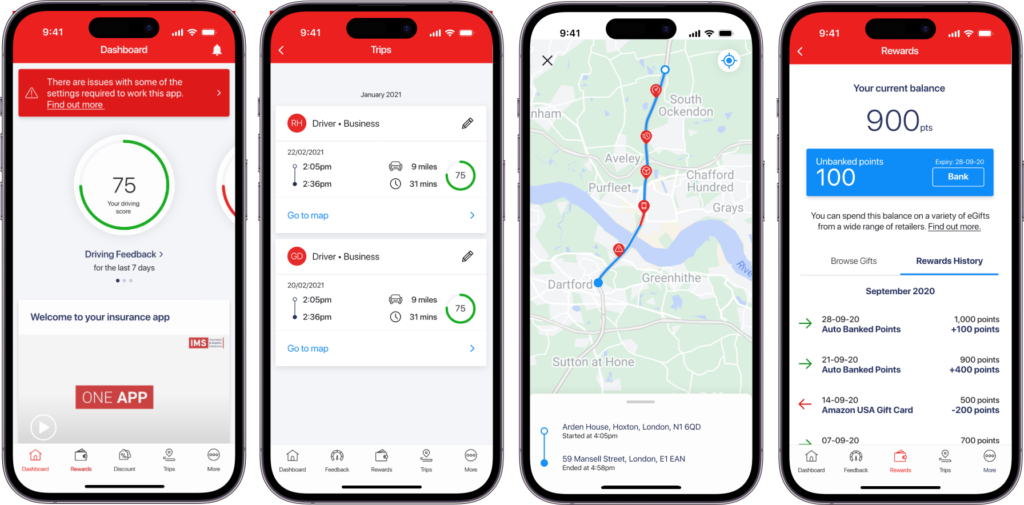
User testing
Once the UI was complete the development team hand-off took place using Zeplin, and an IMS branded version of the whitelabled app was built. A series of tests were then performed with a number of customers in order to assess the user experience. During the testing process customers were asked to perform the following tasks:
- Perform a UX diary study over a period of 30 days, in order to assess the app from and end-user perspective, recording feedback on their experience.
- Complete a survey at the end of the test period.
- Attend a remote focus group at the end of the test period to discuss feedback and provide an overall view of the app user experience.
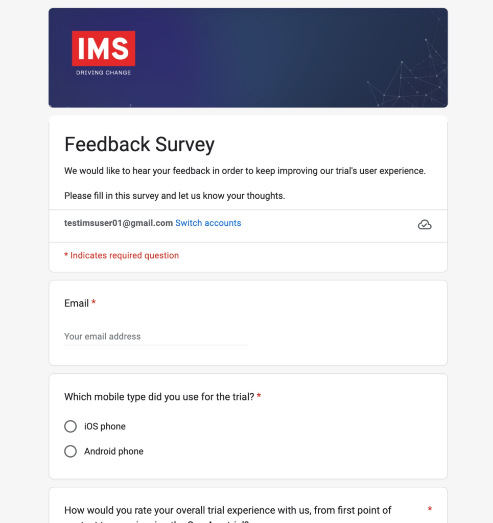
Launch and iteration
Once user testing was complete, we launched the product out to the market. We then adapted the user testing approach mentioned above into a trial format, for the purposes of enabling potential customers to demo the app prior to purchase and to collect their feedback for continuous improvement. Trials run for a period of 6 weeks, with an additional touch point mid trial to collect a status update on their current experience. Using this approach since launch in March 2023, we have produced the following results:
40%
Increase in customer satisfaction
65%
Increase in active users
20%
Increase in session length
14%
Increase in revenue