MoreThan
LowMiler Quote and Buy journey
Improvement of the quote and buy purchase journey for the MoreTHan Low Miler car insurance proposition, through user testing and A/B testing, in order to increase conversion and reduce policy cancellations.
20% Off On Tank Tops
Lorem ipsum dolor sit amet, consectetur adipiscing elit. Proin ac dictum.
Latest Eyewear For You
Lorem ipsum dolor sit amet, consectetur adipiscing elit. Proin ac dictum.
Let's Lorem Suit Up!
Lorem ipsum dolor sit amet, consectetur adipiscing elit. Proin ac dictum.
Home / MoreThan
Primary goals
Being the primary UX account holder at IMS for MoreTnan car insurance, I was tasked with improving purchase conversion of their LowMiler online quote and buy proposition, a product designed to provide cheaper insurance for drivers with low annual mileage. The primary goals being to:
- Improve visibility of user behaviour across their quote and buy journey.
- Identify end user pain points across their conversion funnel.
- Improve customer experience, ultimately leading to increased purchase conversion.


User behaviour analysis
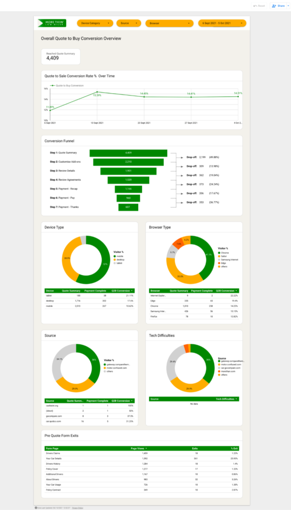
My first task during this project was to identify the key pain-points of the user journey, as perceived by end-users. The implementation of the correct analytics infrastructure is vital to the success of a product, enabling informed decisions on how to identify potential issues, determine opportunities for further optimisation and monitor improvements in customer experience. Using the below tooling I created a transparent view of user behaviour across the quote to buy funnel:
- Google Analytics – To house all the raw user behaviour data.
- Google Tag Manager – To create bespoke event tracking based on KPIs.
- Looker Data Studio – To visualise the Google Analytics data for MoreThan key stakeholders in an easily digestible fashion.
This enabled MoreThan to have visibility of all potential issues and pain points across the funnel, highlighted by drop-off and exit rates.
Digital experience analysis
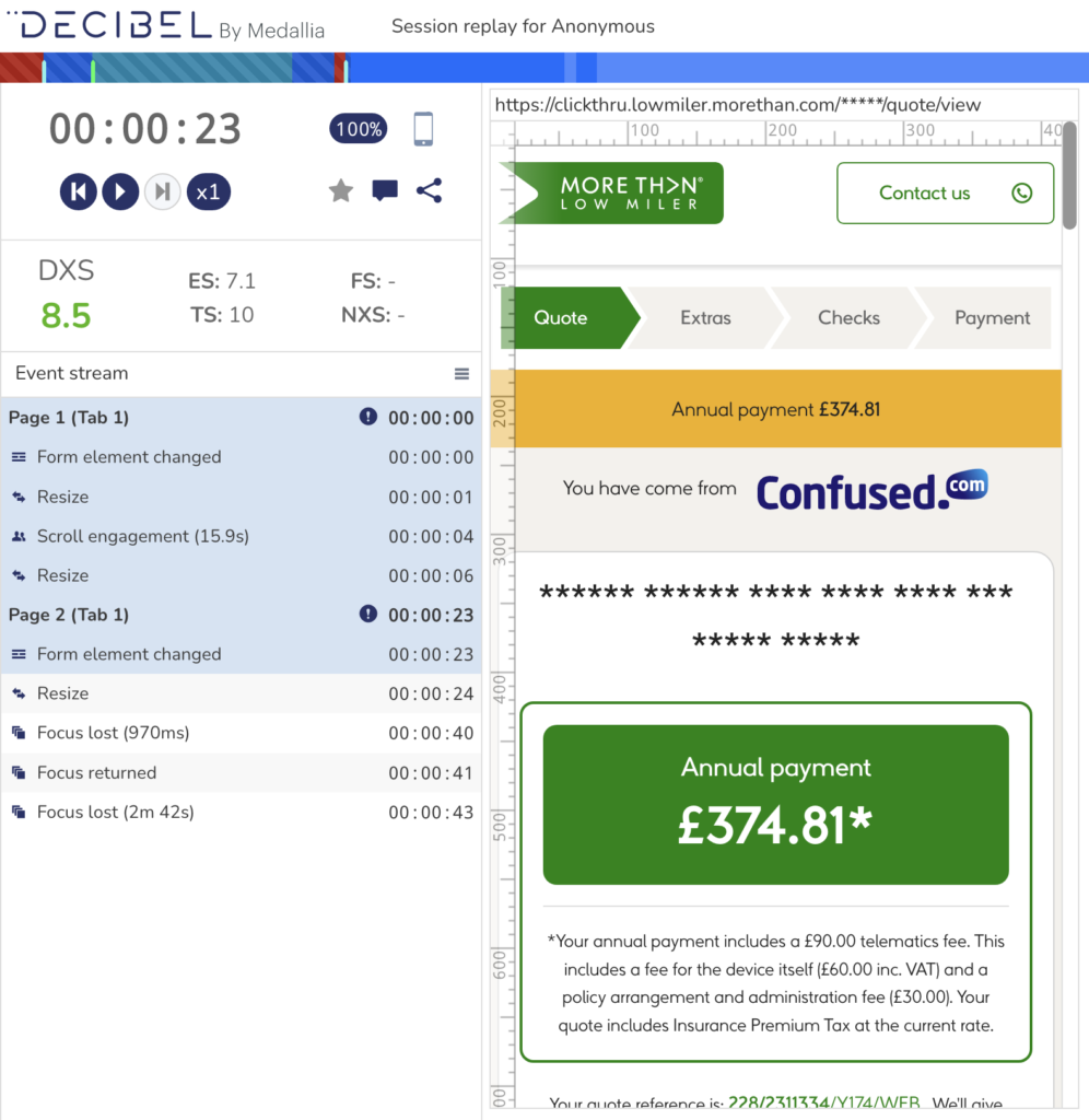
Alongside quantitative user behaviour analysis I also recommended the implementation of Decibel Insight, a session recording tool, used to collect qualitative data and gain insight into specific user behaviours. This proved incredibly useful in order to dig deeper into the analytical data and highlight why certain issues occur.

User testing
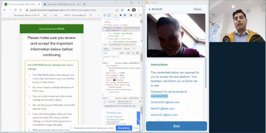
Once we had a clearer picture of potential issues faced by end-users, I then performed usability testing, identifying the attitudes of end users in order to highlight why the usability problems occurred.
Five test participants were selected across a mixed demographic of age and technical experience. All candidates were classified as vehicle owners over the age of 25 who self identify as regularly driving under 7,000 miles per year.
The participants’ responsibilities were to attempt to complete a set of representative task scenarios (determined via test scripts), and to provide feedback regarding the usability and acceptability of the user interface.

A/B Testing
I created an A/B testing roadmap, over a period of 3 months, in order to test the default experience versus a series of variations with suggested improvements.
I then owned the end-to-end delivery of testing campaigns, including but not limited to the following:
- Wireframe and design of new variations
- A/B test code creation
- A/B test implementation
- A/B test outcome reporting

Wireframe Prototype
Due to the success of the optimisation roadmap, the decision was made by the client to redesign the whole LowMiler quote and buy journey in order to start with a blank canvas to continually improve their proposition. As such, I was the tasked with producing a full set of wireframe prototypes, using Adobe XD, incorporating the findings from user research and A/B testing. The final prototype can be viewed here.

UI design
I then worked with a new starter in the UI team, coaching them through the the high fidelity designs, using Adobe XD. I assisted them with how to use the MoreThan brand guidelines in order to set up a design system, in addition to how to use Zeplin to hand-off development work, ready for build . I found this really rewarding as the new designer then continued to utilise this approach moving forward on other projects.

Launch and iteration
After launch of the new quote and buy journey the improvements in KPIs increased considerably more than expected and the client was incredibly happy with the end result. Highlights of the key metrics can be seen below:
30%
Increase quote landing page CTR
12%
Increase in conversion
18%
Reduction in policy cancellations